# 一般常见样式处理及开发技巧
| 🐎 提高幸福感的9个CSS技巧学习 | CSS美化单选框 radio 、多选框 checkbox 和 switch开关按钮 |
|---|---|
| 图片处理学习 | 文字处理学习 |
| 垂直居中水平居中 | CSS作画 |
| 滚动条自定义学习 | 计算函数calc与css变量学习 |
| CSS绝对定位absolute详解 | CSS浮动float详解 |
前端常见标签样式设置:如<a> | 20个 CSS 快速提升技巧 |
| CSS提效技巧 |
# 通用媒体查询
@media only screen and (min-device-width : 320px) and (max-device-width : 480px) {
  /* Styles */
}
@media only screen and (min-width : 321px) {
  /* Styles */
}
@media only screen and (max-width : 320px) {
  /* Styles */
}
/* iPad */
@media only screen and (min-device-width : 768px) and (max-device-width : 1024px) {
  /* Styles */
}
@media only screen and (min-device-width : 768px) and (max-device-width : 1024px) and (orientation : landscape) {
  /* Styles */
}

@media only screen and (min-device-width : 768px) and (max-device-width : 1024px) and (orientation : portrait) {
  /* Styles */
}
/* 桌面 */
@media only screen and (min-width : 1224px) {
  /* Styles */
}

@media only screen and (min-width : 1824px) {
  /* Styles */
}

@media only screen and (-webkit-min-device-pixel-ratio:1.5), only screen and (min-device-pixel-ratio:1.5) {
  /* Styles */
}
2
3
4
5
6
7
8
9
10
11
12
13
14
15
16
17
18
19
20
21
22
23
24
25
26
27
28
29
30
31
32
33
# CSS引用样式
blockquote {
    background: #f9f9f9;
    border-left: 10px solid #ccc;
    margin: 1.5em 10px;
    padding: .5em 10px;
    quotes: "\201C""\201D""\2018""\2019";
}
blockquote:before {
    color: #ccc;
    content: open-quote;
    font-size: 4em;
    line-height: .1em;
    margin-right: .25em;
    vertical-align: -.4em;
}
blockquote p {
    display: inline;
}
2
3
4
5
6
7
8
9
10
11
12
13
14
15
16
17
18
# css中的清除
# 清除浮动
.clearfix:before, .container:after { content: ""; display: table; }
.clearfix:after { clear: both; }
.clearfix { zoom: 1; }
2
3
- 父级上增加属性
overflow:hidden - 在最后一个子元素的后面加一个空的div,给它样式属性 clear:both(不推荐)
- 使用成熟的清浮动样式类,clearfix
.clearfix:after,.clearfix:before{ content: "";display: table;}
.clearfix:after{ clear:both;}
.clearfix{zoom:1;}
2
3
清除浮动的使用方法:
.con2{... overflow:hidden}
或者
<div class="con2 clearfix">
# 用 font-size :0 来清除边距
# pointer-events
利用pointer-events禁用事件光标变成default阻止hover和hover以及JavaScript 点击事件的触发pointer-events:none;
# 图像灰度 滤镜
img {
    filter: gray;
    -webkit-filter: grayscale(1);
}
2
3
4
# css元素透明
.transparent {
    filter: alpha(opacity=50);
    -khtml-opacity: 0.5;
    -moz-opacity: 0.5;
    opacity: 0.5;
}
2
3
4
5
6
# CSS 光影技术
# 创建动态阴影
创建类似于box-shadow的阴影,但
基于元素本身的颜色
<div class="dynamic-shadow"></div>
.dynamic-shadow {
  position: relative;
  width: 10rem;
  height: 10rem;
  background: linear-gradient(75deg, #6d78ff, #00ffb8);
  z-index: 1;
}
.dynamic-shadow::after {
  content: '';
  width: 100%;
  height: 100%;
  position: absolute;
  background: inherit;
  top: 0.5rem;
  filter: blur(0.4rem);
  opacity: 0.7;
  z-index: -1;
}
2
3
4
5
6
7
8
9
10
11
12
13
14
15
16
17
18
# CSS3发光效果
# text-shadow
CSS3 并没有直接设置发光效果的属性,但是可以利用 text-shadow 属性实现此效果
text-shadow: h-shadow v-shadow blur color;
box-shadow:;
2
- h-shadow: 水平阴影的位置(阴影水平偏移量),可为负值,必需
- v-shadow: 垂直阴影的位置(阴影垂直偏移量),可为负值,必需
- blur: 阴影模糊的距离(默认为0),可选
- color: 阴影颜色(默认为当前字体颜色),可选
当阴影的水平偏移量和垂直偏移量都为0时,阴影就和文本重合了,这时,如果增大阴影模糊的距离,就可以达到字体外发光的效果了。
# box-shadow
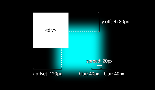
取值说明:
inset: 默认阴影在边框外。使用 inset 后,阴影在边框内(即使是透明边框),背景之上内容之下。也有些人喜欢把这个值放在最后,浏览器也支持。<offset-x> <offset-y>: 这是头两个<length>值,用来设置阴影偏移量。<offset-x>设置水平偏移量,如果是负值则阴影位于元素左边。<offset-y>设置垂直偏移量,如果是负值则阴影位于元素上面。可用单位请查看<length>。如果两者都是0,那么阴影位于元素后面。这时如果设置了<blur-radius>或<spread-radius>则有模糊效果。<blur-radius>: 这是第三个<length>值。值越大,模糊面积越大,阴影就越大越淡。 不能为负值。默认为0,此时阴影边缘锐利。<spread-radius>: 这是第四个<length>值。取正值时,阴影扩大;取负值时,阴影收缩。默认为0,此时阴影与元素同样大。<color>: 相关事项查看<color>。如果没有指定,则由浏览器决定——通常是color的值,不过目前Safari取透明。
# CSS position
不为元素预留空间,而是通过指定元素相对于屏幕视口(viewport)的位置来指定元素位置。元素的位置在屏幕滚动时不会改变。打印时,元素会出现在的每页的固定位置。fixed 属性会创建新的层叠上下文。当元素祖先的 transform 属性非 none 时,容器由视口改为该祖先。
# CSS样式浮动
# 浮动
浮动特性
- 浮动元素有左浮动(float:left)和右浮动(float:right)两种
- 浮动的元素会向左或向右浮动,碰到父元素边界、其他元素才停下来
- 相邻浮动的块元素可以并在一行,超出父级宽度就换行
- 浮动让行内元素或块元素自动转化为行内块元素(此时不会有行内块元素间隙问题)
- 浮动元素后面没有浮动的元素会占据浮动元素的位置,没有浮动的元素内的文字会避开浮动的元素,形成文字饶图的效果
- 父元素如果没有设置尺寸(一般是高度不设置),父元素内整体浮动的元素无法撑开父元素,父元素需要清除浮动
- 浮动元素之间没有垂直margin的合并
# 使用caret-color来修改光标的颜色
caret-color: #ffd476;
# outline:none删除输入状态线
# 去除inline-block元素间间距的7种方法
WARNING
两个相邻的radio之间总是多那么一点点的间距,不是margin也不是padding
# 方法之移除空格
元素间留白间距出现的原因就是标签段之间的空格,因此,去掉HTML中的空格,自然间距就木有了
<div class="space">
 <a href="##">
 惆怅</a><a href="##">
 淡定</a><a href="##">
 热血</a>
</div>

<div class="space">
 <a href="##">惆怅</a
 ><a href="##">淡定</a
 ><a href="##">热血</a>
</div>

<!-- 借助HTML注释 -->
<div class="space">
 <a href="##">惆怅</a><!--
 --><a href="##">淡定</a><!--
 --><a href="##">热血</a>
</div>
2
3
4
5
6
7
8
9
10
11
12
13
14
15
16
17
18
19
# 使用margin负值
具体数值是多少需要调试,也是比较难兼容
.space a {
 display: inline-block;
 margin-right: -3px;
}
2
3
4
# 让闭合标签吃胶囊
为了向下兼容IE6/IE7等喝蒙牛长大的浏览器,最后一个列表的标签的结束(闭合)标签不能丢。
<div class="space">
 <a href="##">惆怅
 <a href="##">淡定
 <a href="##">热血</a>
</div>
2
3
4
5
<!-- 在HTML5中,我们直接: -->
<div class="space">
 <a href="##">惆怅
 <a href="##">淡定
 <a href="##">热血
</div>
2
3
4
5
6
# 使用font-size:0
.space {
 font-size: 0;
}
.space a {
 font-size: 12px;
}
2
3
4
5
6
考虑到兼容性,(Chrome, 其默认有最小字体大小限制)
.space {
 font-size: 0;
 -webkit-text-size-adjust:none;
}
2
3
4
# 使用letter-spacing
.space {
 letter-spacing: -3px;
}
.space a {
 letter-spacing: 0;
}
2
3
4
5
6
# 使用word-spacing
.space {
 word-spacing: -6px;
}
.space a {
 word-spacing: 0;
}
2
3
4
5
6
# 其他成品方法
# 兄弟元素淡化
<div class="sibling-fade">
  <span>Item 1</span> <span>Item 2</span> <span>Item 3</span> <span>Item 4</span>
  <span>Item 5</span> <span>Item 6</span>
</div>
2
3
4
span {
  padding: 0 1rem;
  transition: opacity 0.2s;
}
.sibling-fade:hover span:not(:hover) {
  opacity: 0.5;
}
2
3
4
5
6
7
# not伪类选择器
:not 伪选择器对于设置一组元素的样式非常有用,同时保留最后一个(指定的)元素的样式。
<ul class="css-not-selector-shortcut">
  <li>One</li>
  <li>Two</li>
  <li>Three</li>
  <li>Four</li>
</ul>
2
3
4
5
6
.css-not-selector-shortcut {
  display: flex;
}
ul {
  padding-left: 0;
}
li {
  list-style-type: none;
  margin: 0;
  padding: 0 0.75rem;
}
li:not(:last-child) {
  border-right: 2px solid #d2d5e4;
}
2
3
4
5
6
7
8
9
10
11
12
13
14
li:not(:last-child) 设置除last:child之外的所有li元素的样式,所以最后一个元素右侧没有 border.
# 指定元素的全屏
<div class="container">
  <p><em>Click the button below to enter the element into fullscreen mode. </em></p>
  <div class="element" id="element"><p>I change color in fullscreen mode!</p></div>
  <br />
  <button onclick="var el = document.getElementById('element'); el.requestFullscreen();">
    Go Full Screen!
  </button>
</div>
2
3
4
5
6
7
8
.container {
  margin: 40px auto;
  max-width: 700px;
}
.element {
  padding: 20px;
  height: 300px;
  width: 100%;
  background-color: skyblue;
}
.element p {
  text-align: center;
  color: white;
  font-size: 3em;
}
.element:-ms-fullscreen p {
  visibility: visible;
}
.element:fullscreen {
  background-color: #e4708a;
  width: 100vw;
  height: 100vh;
}
2
3
4
5
6
7
8
9
10
11
12
13
14
15
16
17
18
19
20
21
22
23
# 吸底或者吸顶效果
<!-- wrapper是包裹content和footer的父容器 --></div>
<div class="wrapper">
   <div class="content">
     <ul>
       <!-- 页面主体内容区域 --></div>
       <li>1.这是内容,这是内容……</li>
       <li>2.这是内容,这是内容……</li>
       <li>3.这是内容,这是内容……</li>
       <li>4.这是内容,这是内容……</li>
       <li>5.这是内容,这是内容……</li>
       <li>6.这是内容,这是内容……</li>
       <li>7.这是内容,这是内容……</li>
       <li>8.这是内容,这是内容……</li>
       <li>9.这是内容,这是内容……</li>
      </ul>
   </div>
  <div class="footer">
    <!-- 需要做到吸底的区域 -->
    底部按钮
  </div>
 </div>
2
3
4
5
6
7
8
9
10
11
12
13
14
15
16
17
18
19
20
21
# 使用position对需固定元素定位
html,
body
  height 100%
.wrapper
  position relative // 关键
  box-sizing border-box
  min-height 100% // 关键
  padding-bottom 100px   // 该值设置大于等于按钮的高度
  ul
    list-style none
    li
      height 100px
      background lightblue
.footer
  position absolute // 关键
  bottom 0
  left 0
  right 0
  height 100px // 设置固定高度
  background orange
2
3
4
5
6
7
8
9
10
11
12
13
14
15
16
17
18
19
20
# 使用flexbox布局实现
- 设置wrapper的min-height:100%,这里设置的是min-height而非height,是想使整个wrapper的最小高度撑开至全屏,即内容不足以充满屏幕时,wrapper的高度仍是全屏;当wrapper的高度随着content的高度增大而变化,它的高度是可以大于可视窗口高度,而不一直都等于屏幕的高度。
- 设置wrapper的布局方式为flex,且content的flex:1,使content的高度始终为wrapper的减去底部footer的高度。
html,
body
  height 100%
.wrapper
  min-height 100% // 关键
  display flex // 关键
  flex-direction column // 关键
.content
  flex 1  //关键
  ul
    list-style none
    li
      height 100px
      background lightblue
// 高度可不设置
.footer
    padding 20px
    background orange
2
3
4
5
6
7
8
9
10
11
12
13
14
15
16
17
18
# fixed
由于footer因设置了fixed而脱离了文档流,因此需给wrapper设置padding,该值应大于等于按钮的高度,这样才能保证footer不会覆盖content区域的内容。
html,
body
  height 100%
.wrapper
  display flex // 关键
  min-height 100% // 关键
  padding-bottom 62px // 该值设置大于等于按钮的高度
  flex-direction column // 关键
.content
  flex 1  //关键
  ul
    list-style: none
  li
    height 100px
    background lightblue
.footer
  position fixed  // 关键
  left 0
  right 0
  bottom 0
  padding 20px
  background orange
2
3
4
5
6
7
8
9
10
11
12
13
14
15
16
17
18
19
20
21
22
# 子元素div撑不开父元素div
- (一):加
<div style="clear:both;"></div>
<!--方法一-->
<div class="example">
    <div class="childrenDiv" style="background: #e9b216;">tatatattttaatatatatatatata</div>
    <div class="childrenDiv" style="background: #df4744;">tatatattttaatatatatatatata</div>
    <!--解决方法-->
    <div style="clear: both;"></div>
</div>
2
3
4
5
6
7
父div作为外部容器,
子div设置了float样式,则外部容器div因为内部没有clear导致不能被撑开,即内部div因为float:left之后,就丢失了clear:both和display:block的样式。
- (三)父容器增加一个属性:
overflow:hidden
<!--方法三-->
<div class="example" style="overflow: hidden;">
    <div class="childrenDiv" style="background: #e9b216;">tatatattttaatatatatatatata</div>
    <div class="childrenDiv" style="background: #df4744;">tatatattttaatatatatatatata</div>
</div>
2
3
4
5
- (四)父容器增加一个属性:display:table
<!--方法四-->
<div class="example" style="display: table;">
    <div class="childrenDiv" style="background: #e9b216;">tatatattttaatatatatatatata</div>
    <div class="childrenDiv" style="background: #df4744;">tatatattttaatatatatatatata</div>
</div>
2
3
4
5
当然还有最简单最普通的原因,即:父元素设置了固定高度
# 解决图片5px间距
# 给父元素设置font-size: 0
html,body{
  margin: 0;
  padding: 0;
}

.img-container{
  background-color: lightblue;
  font-size: 0;
}

img{
  width: 100%;
}
2
3
4
5
6
7
8
9
10
11
12
13
14
# 给img设置display: block
html,body{
  margin: 0;
  padding: 0;
}

.img-container{
  background-color: lightblue;
}

img{
  width: 100%;
  /*关键css*/
  display: block;
}
2
3
4
5
6
7
8
9
10
11
12
13
14
15
# 给img设置vertical-align: bottom
html,body{
  margin: 0;
  padding: 0;
}

.img-container{
  background-color: lightblue;
}

img{
  width: 100%;
  /*关键css*/
  vertical-align: bottom;
}
2
3
4
5
6
7
8
9
10
11
12
13
14
15
# 给父元素设置line-height: 5px
html,body{
  margin: 0;
  padding: 0;
}

.img-container{
  background-color: lightblue;
  /*关键css*/
  line-height: 5px;
}

img{
  width: 100%;
}
2
3
4
5
6
7
8
9
10
11
12
13
14
15
# 图片尺寸自适应
.box, .box-vw{
  background-color: #f5f6f9;
  border-radius: 10px;
  overflow: hidden;
  margin-bottom: 15px;
}

.box:nth-of-type(2){
  width: 260px;
}
/* vw方案 */
.box-vw .img-container{
  width: 100vw;
  height: 66.620879vw;
  padding-bottom: inherit;
}
/* padding方案 */
.img-container{
  width: 100%;
  height: 0;
  /* 图片的高宽比 */
  padding-bottom: 66.620879%;
}

img{
width: 100%;
}
2
3
4
5
6
7
8
9
10
11
12
13
14
15
16
17
18
19
20
21
22
23
24
25
26
27
# 元素高度跟随窗口
TIP
有时候希望某个元素的高度和窗口是一致的,如果用百分比设置,那html、body等元素也要跟着一顿设置height: 100%有没有更简单的方法呢?
*{
  margin: 0;
  padding: 0;
}

.child{
  width: 100%;
  /*关键css*/
  height: 100vh;
  background-image: linear-gradient(180deg, #2af598 0%, #009efd 100%);
}
2
3
4
5
6
7
8
9
10
11
# 修改input placeholder样式
<input type="text" class="placehoder-custom" placeholder="请输入用户名搜索">
<input type="text" placeholder="请输入用户名搜索">
2
input{
  width: 300px;
  height: 30px;
  border: none;
  outline: none;
  display: block;
  margin: 15px;
  border: solid 1px #dee0e9;
  padding: 0 15px;
  border-radius: 15px;
}

.placehoder-custom::-webkit-input-placeholder{
  color: #babbc1;
  font-size: 12px;
}
2
3
4
5
6
7
8
9
10
11
12
13
14
15
16
17
# 巧用not选择器
<ul>
    <li>
      <span>单元格</span>
      <span>内容</span>
    </li>
    <li>
      <span>单元格</span>
      <span>内容</span>
    </li>
    <li>
      <span>单元格</span>
      <span>内容</span>
    </li>
    <li>
      <span>单元格</span>
      <span>内容</span>
    </li>
</ul>
2
3
4
5
6
7
8
9
10
11
12
13
14
15
16
17
18
li:not(:last-child){
  border-bottom: 1px solid #ebedf0;
}
2
3
4
# 使用caret-color改变光标颜色
.caret-color {
  /* 关键css */
  caret-color: #ffd476;
}
2
3
4
# 移除type="number"尾部的箭头
/* 关键css */
.no-arrow::-webkit-outer-spin-button,
.no-arrow::-webkit-inner-spin-button {
  -webkit-appearance: none;
}
2
3
4
5
6
# outline:none移除input状态线
.no-outline{
  outline: none;
}
2
3
4
# 解决IOS滚动条卡顿
body,html{
  -webkit-overflow-scrolling: touch;
}
2
3
# 画三角形
<div class="box">
  <div class="box-inner">
    <div class="triangle bottom"></div>
    <div class="triangle right"></div>
    <div class="triangle top"></div>
    <div class="triangle left"></div>
  </div>
</div>
2
3
4
5
6
7
8
.triangle {
  display: inline-block;
  margin-right: 10px;
  /* 基础样式 */
  border: solid 10px transparent;
}
  /*下*/
.triangle.bottom {
  border-top-color: #0097a7;
}
  /*上*/
.triangle.top {
  border-bottom-color: #b2ebf2;
}
/*左*/
.triangle.left {
  border-right-color: #00bcd4;
}
/*右*/
.triangle.right {
  border-left-color: #009688;
}
2
3
4
5
6
7
8
9
10
11
12
13
14
15
16
17
18
19
20
21
22
23
# 画小箭头
<div class="box">
  <div class="box-inner">
    <div class="triangle bottom"></div>
    <div class="triangle right"></div>
    <div class="triangle top"></div>
    <div class="triangle left"></div>
  </div>
</div>
2
3
4
5
6
7
8
  .arrow {
    display: inline-block;
    margin-right: 10px;
    /* 基础样式 */
    width: 0;
    height: 0;
    /* 基础样式 */
    border: 16px solid;
    border-color: transparent #CDDC39 transparent transparent;
    position: relative;
  }

  .arrow::after {
    content: "";
    position: absolute;
    /* 通过位移覆盖背景 */
    right: -20px;
    top: -16px;
    border: 16px solid;
    border-color: transparent #fff transparent transparent;
  }
  /*下*/
  .arrow.bottom {
    transform: rotate(270deg);
  }
  /*上*/
  .arrow.top {
    transform: rotate(90deg);
  }
  /*左*/
  .arrow.left {
    transform: rotate(180deg);
  }
  /*右*/
  .arrow.right {
    transform: rotate(0deg);
  }
2
3
4
5
6
7
8
9
10
11
12
13
14
15
16
17
18
19
20
21
22
23
24
25
26
27
28
29
30
31
32
33
34
35
36
37
38
# 隐藏滚动条
.box {
  width: 375px;
  overflow: scroll;
}

/* 关键代码 */
.box-hide-scrollbar::-webkit-scrollbar {
  display: none; /* Chrome Safari */
}

.box > div {
  margin-bottom: 15px;
  padding: 10px;
  background-color: #f5f6f9;
  border-radius: 6px;
  font-size: 12px;
  width: 750px;
}
2
3
4
5
6
7
8
9
10
11
12
13
14
15
16
17
18
19
# 自定义文本选中的样式
.box-custom::selection {
  color: #ffffff;
  background-color: #ff4c9f;
}
2
3
4