# flex
Flex
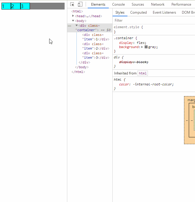
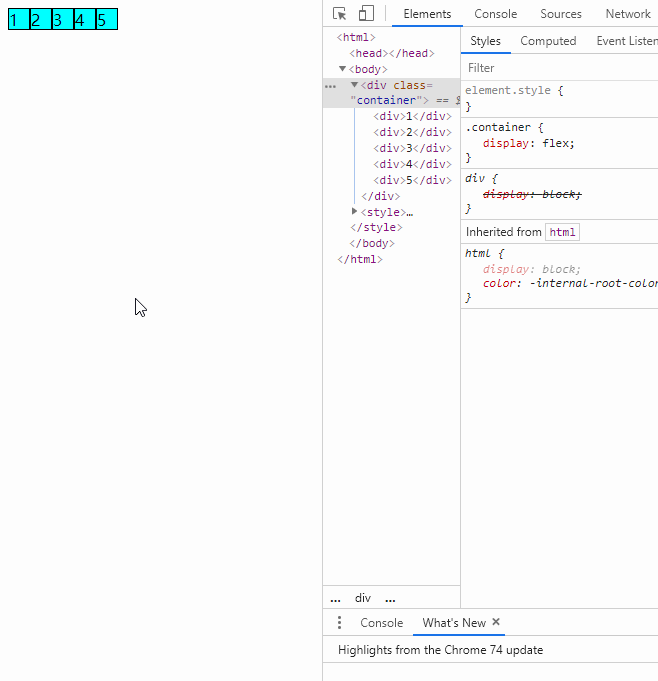
是 Flexible Box 的缩写,意为"弹性布局",用来为盒状模型提供最大的灵活性。我们可以把一个容器(div、span等),设置它的 CSS 的 display 属性为 flex 之后,我们就可以使用 Flex 的布局方式了。
一旦容器设置display: flex布局之后,我们使用的传统布局中的float、vertical-align、clear等属性就完全失效了。但是我们可以通过 Flex 设置的属性去进行布局
.box{
 display: flex;
}
2
3
行内元素也可以使用 Flex 布局。
.box{
 display: inline-flex;
}
2
3
Webkit 内核的浏览器,必须加上-webkit前缀。
.box{
 display: -webkit-flex; /* Safari */
 display: flex;
}
2
3
4
注意
设为 Flex 布局以后,子元素的float、clear和vertical-align属性将失效。
# 基本概念
采用 Flex 布局的元素,称为 Flex 容器(flex container),简称"容器"。它的所有子元素自动成为容器成员,称为 Flex 项目(flex item),简称"项目"。
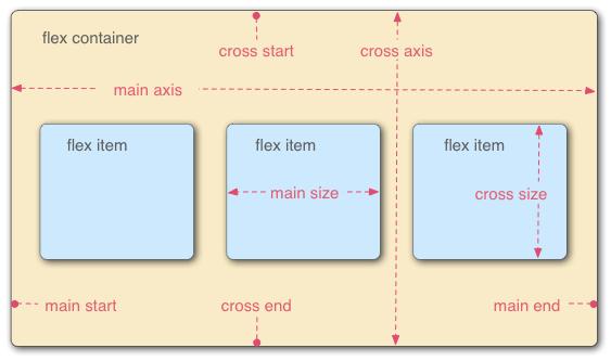
容器默认存在两根轴:
- 水平的主轴(main axis)
- 垂直的交叉轴(cross axis)
主轴的开始位置(与边框的交叉点)叫做main start,结束位置叫做main end;交叉轴的开始位置叫做cross start,结束位置叫做cross end。
项目默认沿主轴排列。单个项目占据的主轴空间叫做main size,占据的交叉轴空间叫做cross size。
# 容器属性
以下6个属性设置在容器上。
# 2.1 flex-direction
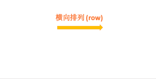
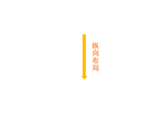
属性决定主轴的方向(即项目的排列方向)
.box {
 flex-direction: column | column-reverse | row | row-reverse ;
}
2
3
它可能有4个值。
- row(默认值):主轴为水平方向,起点在左端。
- row-reverse:主轴为水平方向,起点在右端。
- column:主轴为垂直方向,起点在上沿。
- column-reverse:主轴为垂直方向,起点在下沿。
# 2.2 flex-wrap
默认情况下,项目都排在一条线(又称"轴线")上。flex-wrap属性定义,如果一条轴线排不下,如何换行。
.box{
 flex-wrap: nowrap | wrap | wrap-reverse;
}
2
3
- (1)nowrap(默认):不换行。
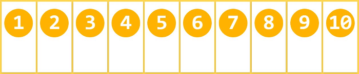
- (2)wrap:换行,第一行在上方。
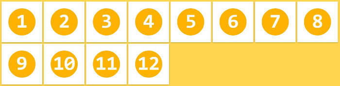
- (3)wrap-reverse:换行,第一行在下方。(即新元素换到第一行)
# 2.3 flex-flow
是flex-direction属性和flex-wrap属性的简写形式,默认值为row nowrap。
.box {
 flex-flow: <flex-direction> || <flex-wrap>;
}
2
3
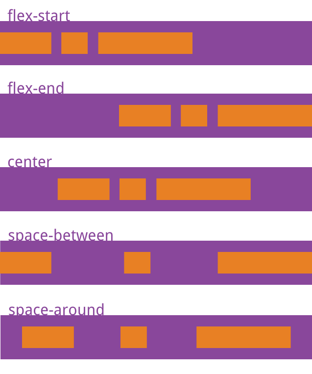
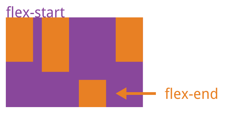
# 2.4 justify-content
定义了项目在主轴上的对齐方式
.box {
 justify-content: flex-start | flex-end | center | space-between | space-around;
}
2
3
- flex-start(默认值):左对齐
- flex-end:右对齐
- center: 居中
- space-between:两端对齐,项目之间的间隔都相等。
- space-around:每个项目两侧的间隔相等。所以,项目之间的间隔比项目与边框的间隔大一倍。
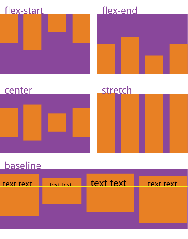
# 2.5 align-items
定义项目在交叉轴上如何对齐。
.box {
 align-items: flex-start | flex-end | center | baseline | stretch;
}
2
3
- flex-start:交叉轴的起点对齐。
- flex-end:交叉轴的终点对齐。
- center:交叉轴的中点对齐。
- baseline: 项目的第一行文字的基线对齐。
- stretch(默认值):如果项目未设置高度或设为auto,将占满整个容器的高度。
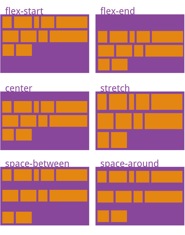
# 2.6 align-content
定义了多根轴线的对齐方式。如果项目只有一根轴线,该属性不起作用
.box {
 align-content: flex-start | flex-end | center | space-between | space-around | stretch;
}
2
3
- flex-start:与交叉轴的起点对齐。
- flex-end:与交叉轴的终点对齐。
- center:与交叉轴的中点对齐。
- space-between:与交叉轴两端对齐,轴线之间的间隔平均分布。
- space-around:每根轴线两侧的间隔都相等。所以,轴线之间的间隔比轴线与边框的间隔大一倍。
- stretch(默认值):轴线占满整个交叉轴。
# 项目属性
# 3.1 order
定义项目的排列顺序。数值越小,排列越靠前,默认为0。
.item {
 order: <integer>;
}
2
3
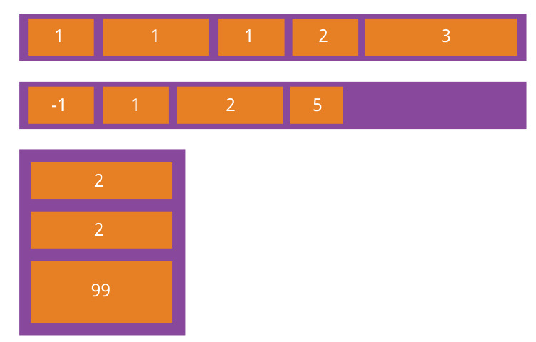
# 3.2 flex-grow
flex-grow属性定义项目的放大比例,默认为0,即如果存在剩余空间,也不放大。flex-grow的值只接受一个整数。
WARNING
flex-grow会影响宽度或高度,具体取决于flex-direction属性。对于以下示例,默认的flex-direction的值都是row。
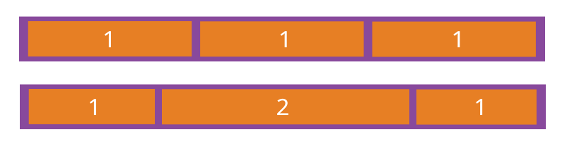
flex-grow 不能让 flex 项目相等:
- 有一个常见的误解,使用flex-grow会使项目的宽度相等。这是不正确的,flex-grow的作用是分配可用空间。正如在公式中看到的,每 flex 项目的宽度是基于其初始宽度计算的(应用flex-grow之前的宽度)。
- 如果你想让项目的宽度相等,可以使用
flex-basis
在不使用flex-grow的情况下,flex 项目的宽度将默认为其初始宽度。但是,使用flex-grow: 1时,flex 项目会平均剩余可用的空间。
.item {
 flex-grow: <number>; /* default 0 */
}
2
3
TIP
如果所有项目的flex-grow属性都为1,则它们将等分剩余空间(如果有的话)。如果一个项目的flex-grow属性为2,其他项目都为1,则前者占据的剩余空间将比其他项多一倍。
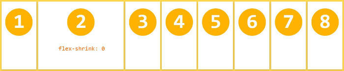
# 3.3 flex-shrink
定义了项目的缩小比例,默认为1,即如果空间不足,该项目将缩小。
.item {
 flex-shrink: <number>; /* default 1 */
}
2
3
TIP
flex-shrink属性都为1,当空间不足时,都将等比例缩小。如果一个项目的flex-shrink属性为0,其他项目都为1,则空间不足时,前者不缩小。
负值对该属性无效。
# 3.4 flex-basis
定义了在分配多余空间之前,项目占据的主轴空间(main size)。浏览器根据这个属性,计算主轴是否有多余空间。它的默认值为auto,即项目的本来大小
.item {
 flex-basis: <length> | auto; /* default auto */
}
2
3
TIP
可以设为跟width或height属性一样的值(比如350px),则项目将占据固定空间。
<div className={styles.flexParent}>
   <div className={styles.flexItem1}>aquamarine</div>
   <div className={styles.flexItem2}>antiquewhite</div>
   <div className={styles.flexItem3}>tomato</div>
</div>
2
3
4
5
.flexParent {
  display: flex;
  .flexItem1 {
    // 将flex-grow重置为0,以防止项目宽度超过50%。
    // flex-basis 设置为 100%,会怎么样?该项目单独占一行,其他项目将换行。
    flex-grow: 0;
    flex-shrink: 0;
    flex-basis: 50%;
    background-color: aquamarine;
    padding: 10px 10px;
  }
  .flexItem2 {
    flex-grow: 1;
    background-color: antiquewhite;
    padding: 10px 10px;
  }
  .flexItem3 {
    flex-grow: 1;
    background-color: tomato;
    padding: 10px 10px;
  }
}
2
3
4
5
6
7
8
9
10
11
12
13
14
15
16
17
18
19
20
21
22
以下项目宽度都一致
.flexParent2 {
  display: flex;
  margin-top: 20px;
  .flexItem1 {
    flex: 1;
    background-color: aquamarine;
    padding: 10px 10px;
  }
  .flexItem2 {
    flex: 1;
    background-color: antiquewhite;
    padding: 10px 10px;
  }
  .flexItem3 {
    flex: 1;
    background-color: tomato;
    padding: 10px 10px;
  }
}
2
3
4
5
6
7
8
9
10
11
12
13
14
15
16
17
18
19
<div className={styles.flexParent2}>
   <div className={styles.flexItem1}>aquamarine</div>
   <div className={styles.flexItem2}>antiquewhite</div>
   <div className={styles.flexItem3}>tomato</div>
</div>
2
3
4
5
# 解决文字图片等内容溢出
- 首先自然是设置width属性即可了,只要width小于剩余空间即可,一般设置为
width: 0;这样可百分之百确定小于剩余空间; - 不设置width但用min-width来限制也是一样的,既然 flex 项 的min-width:auto,那我们也设置一个小于剩余空间的值,一般也是
min-width: 0; - 设置
overflow:hidden来限制溢出效果也是一致的。
以上都是flex-basis导致
# 3.5 flex
flex-grow, flex-shrink 和 flex-basis的简写,默认值为0 1 auto。后两个属性可选。
.item {
 flex: none | [ <'flex-grow'> <'flex-shrink'>? || <'flex-basis'> ]
}
2
3
TIP
性有两个快捷值:auto (1 1 auto) 和 none (0 0 auto)。
建议优先使用这个属性,而不是单独写三个分离的属性,因为浏览器会推算相关值
# 3.6 align-self
允许单个项目有与其他项目不一样的对齐方式,可覆盖align-items属性。默认值为auto,表示继承父元素的align-items属性,如果没有父元素,则等同于stretch
.item {
 align-self: auto | flex-start | flex-end | center | baseline | stretch;
}
2
3
# 左侧固定右侧自适应
- 1、左侧宽度写死——》定位——》给父元素设置左padding即可
- 2、右侧宽度不用设置(自适应)
.father {
   height:300px;
   position:relative;
   border: 3px solid #000;
   padding-left:300px;
}

.left {
   width:300px;
   height:300px;
   background-color:blue;
   position:absolute;
   top:0px;
   right:0px;
}

.right {
   height:300px;
   background-color:yellow;
}
2
3
4
5
6
7
8
9
10
11
12
13
14
15
16
17
18
19
20
# 浮动,触发BFC
- 1、左侧宽度固定——》左浮动
- 2、右侧宽度是自适应——》触发bfc——》overflow:hidden
.father {
   height:300px;
   border: 3px solid #000;
}

.left {
   width:300px;
   height:300px;
   background-color:blue;
   float:left;
}

.right {
   height:310px;
   background-color:yellow;
   overflow:hidden;
}
2
3
4
5
6
7
8
9
10
11
12
13
14
15
16
17
# display-flex
- 给父盒子设置为弹性盒子
- 左侧宽度写死
- 右侧宽度按照份数分配父元素主轴(宽度)的剩余空间
.father {
   height:300px;
   border: 3px solid #000;
   display:flex;
}

.left {
   width:300px;
   height:300px;
   background-color:blue;
}

.right {
   flex:1;
   height:310px;
   background-color:yellow;
}
2
3
4
5
6
7
8
9
10
11
12
13
14
15
16
17
注意
在右侧固定,左侧自适应的布局中如果要使用浮动+触发BFC的方法,在html结构中需要先写右边的盒子!!!
<div class="father">
   <div class="right"></div>
   <div class="left"></div>
</div>
2
3
4
# 你未必知道的flex
# flex布局下margin:auto的神奇用法
# flex布局,当flex-grow之和小于1时,只能按比例分配部分剩余空间,而不是全部