# Silver 系列组件
要同时滚动 ListView 和 GridView 的时候可以使用 SliverList 和 SliverGrid。
# SliverList
SliverList 的用法非常简单,只需一个构建函数,用法如下:
SliverList(
  delegate: SliverChildBuilderDelegate((content, index) {
    return Container(
      height: 65,
      color: Colors.primaries[index % Colors.primaries.length],
    );
  }, childCount: 5),
)
1
2
3
4
5
6
7
8
2
3
4
5
6
7
8
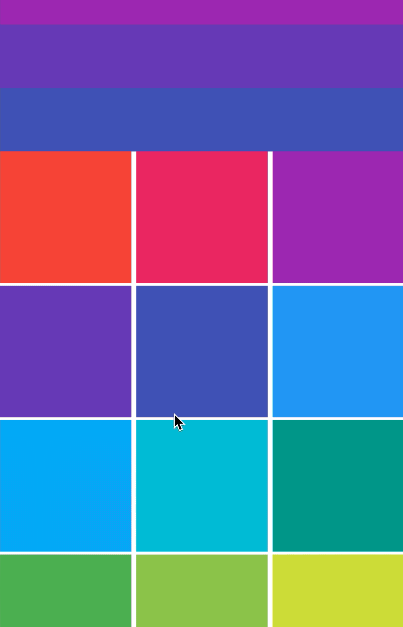
# SliverGrid
同样 SliverGrid 的用法如下:
SliverGrid(
  gridDelegate: SliverGridDelegateWithFixedCrossAxisCount(
      crossAxisCount: 3, crossAxisSpacing: 5, mainAxisSpacing: 3),
  delegate: SliverChildBuilderDelegate((BuildContext context, int index) {
    return Container(
      color: Colors.primaries[index % Colors.primaries.length],
    );
  }, childCount: 20),
)
1
2
3
4
5
6
7
8
9
2
3
4
5
6
7
8
9
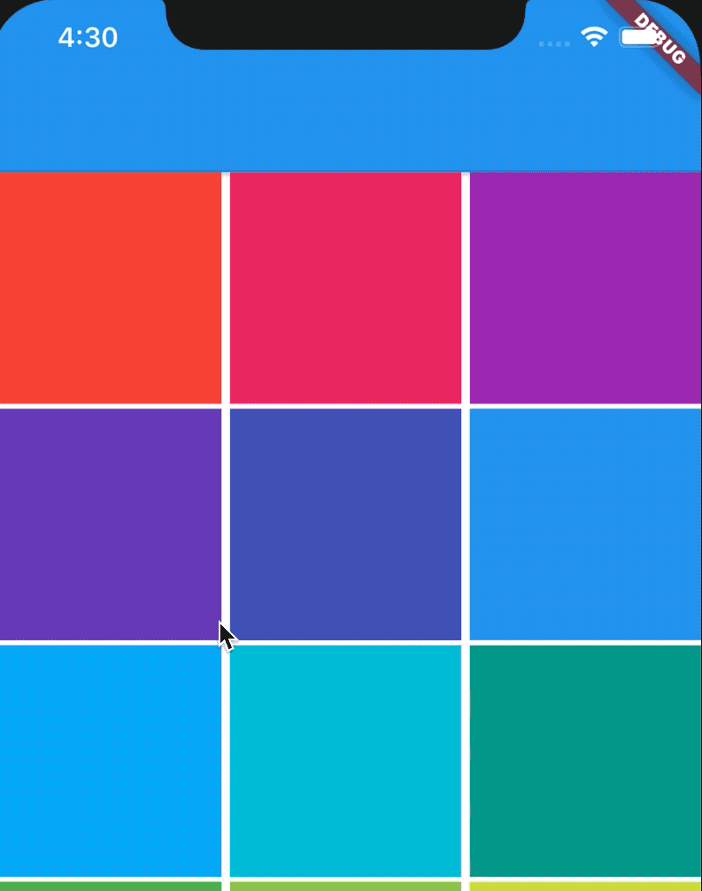
此时需要将 SliverList 和 SliverGrid 放在一起,使用 CustomScrollView,用法如下:
CustomScrollView(slivers: <Widget>[
  SliverList(
    delegate: SliverChildBuilderDelegate((content, index) {
      return Container(
        height: 65,
        color: Colors.primaries[index % Colors.primaries.length],
      );
    }, childCount: 5),
  ),
  SliverGrid(
    gridDelegate: SliverGridDelegateWithFixedCrossAxisCount(
        crossAxisCount: 3, crossAxisSpacing: 5, mainAxisSpacing: 3),
    delegate: SliverChildBuilderDelegate((BuildContext context, int index) {
      return Container(
        color: Colors.primaries[index % Colors.primaries.length],
      );
    }, childCount: 20),
  )
])
1
2
3
4
5
6
7
8
9
10
11
12
13
14
15
16
17
18
19
2
3
4
5
6
7
8
9
10
11
12
13
14
15
16
17
18
19
# SliverAppBar
SliverAppBar 控件可以实现页面头部区域展开、折叠的效果,类似于 Android 中的 CollapsingToolbarLayout
TIP
SliverAppBar 控件需要和 CustomScrollView 搭配使用,SliverAppBar 要通常放在 slivers 的第一位,后面接其他 sliver 控件。
CustomScrollView(
      slivers: <Widget>[
        SliverAppBar(

        ),
        //其他sliver控件
      ],
    )
1
2
3
4
5
6
7
8
2
3
4
5
6
7
8
SliverAppBar 和其他 slivers 控件的结构如下:
- SliverAppBar 中有一个非常重要的参数 flexibleSpace,flexibleSpace 是 SliverAppBar 中展开和折叠区域,flexibleSpace 与 expandedHeight 一起使用,
- expandedHeight 表示 flexibleSpace 的高度,
其他属性
- leading 左侧控件,通常情况下为"返回"图标
- title 标题,通常为 Text 控件
- actions 右侧控件
- flexibleSpace 展开和折叠区域
- bottom 底部控件
- elevation 阴影
- backgroundColor 背景颜色
- expandedHeight 展开区域的高度
- floating 设置为 true 时,向下滑动时,即使当前 CustomScrollView 不在顶部,SliverAppBar 也会跟着一起向下出现
- pinned 设置为 true 时,当 SliverAppBar 内容滑出屏幕时,将始终渲染一个固定在顶部的收起状态
- snap 设置为 true 时,当手指放开时,SliverAppBar 会根据当前的位置进行调整,始终保持展开或收起的状态,此效果在 floating=true 时生效
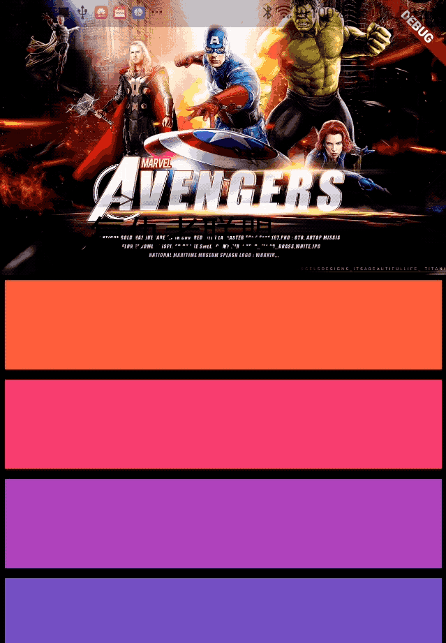
class SliverAppBarDemo extends StatelessWidget {
Widget build(BuildContext context) {
return CustomScrollView(
slivers: <Widget>[
SliverAppBar(
pinned: true,
expandedHeight: 200.0,
flexibleSpace: FlexibleSpaceBar(
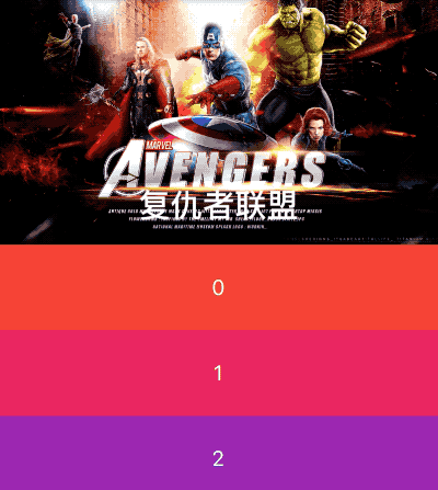
title: Text('复仇者联盟'),
background: Image.network(
'http://img.haote.com/upload/20180918/2018091815372344164.jpg',
fit: BoxFit.fitHeight,
),
),
),
SliverFixedExtentList(
itemExtent: 80.0,
delegate: SliverChildBuilderDelegate(
(BuildContext context, int index) {
return Card(
child: Container(
alignment: Alignment.center,
color: Colors.primaries[(index % 18)],
child: Text(''),
),
);
},
),
),
],
);
}
}
1
2
3
4
5
6
7
8
9
10
11
12
13
14
15
16
17
18
19
20
21
22
23
24
25
26
27
28
29
30
31
32
33
34
2
3
4
5
6
7
8
9
10
11
12
13
14
15
16
17
18
19
20
21
22
23
24
25
26
27
28
29
30
31
32
33
34
# SliverPersistentHeader
控件当滚动到边缘时根据滚动的距离缩小高度,有点类似 SliverAppBar 的背景效果。
CustomScrollView(
  slivers: <Widget>[
    SliverPersistentHeader(
      delegate: MySliverPersistentHeaderDelegate(),
    ),
    SliverGrid(
      gridDelegate: SliverGridDelegateWithFixedCrossAxisCount(
          crossAxisCount: 3, crossAxisSpacing: 5, mainAxisSpacing: 3),
      delegate:
          SliverChildBuilderDelegate((BuildContext context, int index) {
        return Container(
          color: Colors.primaries[index % Colors.primaries.length],
        );
      }, childCount: 20),
    )
  ],
)
1
2
3
4
5
6
7
8
9
10
11
12
13
14
15
16
17
2
3
4
5
6
7
8
9
10
11
12
13
14
15
16
17
class MySliverPersistentHeaderDelegate extends SliverPersistentHeaderDelegate {
Widget build(
BuildContext context, double shrinkOffset, bool overlapsContent) {
return Container(
color: Colors.blue,
alignment: Alignment.center,
child: Text('我是一个SliverPersistentHeader',
style: TextStyle(color: Colors.white)));
}
double get maxExtent => 200.0;
double get minExtent => 100.0;
bool shouldRebuild(SliverPersistentHeaderDelegate oldDelegate) =>
false; // 如果内容需要更新,设置为true
}
1
2
3
4
5
6
7
8
9
10
11
12
13
14
15
16
17
18
19
20
21
2
3
4
5
6
7
8
9
10
11
12
13
14
15
16
17
18
19
20
21
- delegate 需要我们自定义
- build 返回显示的内容
- maxExtent 和 minExtent 表示最大和最小值,滚动的时候高度在这个范围内变化。
- shouldRebuild 表示是否需要更新,如果内容需要变化需要设置为 true。
- floating 设置为 true 时,向下滑动时,即使当前 CustomScrollView 不在顶部,SliverAppBar 也会跟着一起向下出现
- pinned 设置为 true 时,当 SliverAppBar 内容滑出屏幕时,将始终渲染一个固定在顶部的收起状态
# SliverToBoxAdapter
SliverToBoxAdapter
在使用 CustomScrollView 创建自定义滚动效果的时候,CustomScrollView 只能包含 sliver 系列组件,如果包含普通的组件如何处理?使用 SliverToBoxAdapter 包裹。
# CustomScrollView
CustomScrollView
- ListView 和 GridView 相互嵌套场景,ListView 嵌套 GridView 时,需要给 GridView 指定高度,但我们希望高度随内容而变化(不指定),ListView 和 GridView 使用同一个滚动效果。
- 一个页面顶部是 AppBar,然后是 GridView,最后是 ListView,这 3 个区域以整体来滚动,AppBar 具有吸顶效果。
CustomScrollView 就像一个粘合剂,将多个组件粘合在一起,具统一的滚动效果。
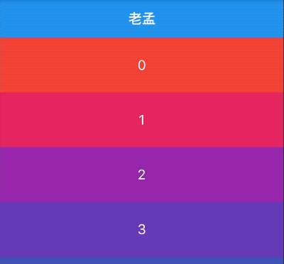
# NestedScrollView
# 滚动隐藏 AppBar
NestedScrollView(
  headerSliverBuilder: (BuildContext context, bool innerBoxIsScrolled) {
    return <Widget>[SliverAppBar(
      title: Text('老孟'),
    )];
  },
  body: ListView.builder(itemBuilder: (BuildContext context,int index){
    return Container(
      height: 80,
      color: Colors.primaries[index % Colors.primaries.length],
      alignment: Alignment.center,
      child: Text(
        '$index',
        style: TextStyle(color: Colors.white, fontSize: 20),
      ),
    );
  },itemCount: 20,),
)
1
2
3
4
5
6
7
8
9
10
11
12
13
14
15
16
17
18
2
3
4
5
6
7
8
9
10
11
12
13
14
15
16
17
18
# SliverAppBar 展开折叠
NestedScrollView(
  headerSliverBuilder: (BuildContext context, bool innerBoxIsScrolled) {
    return <Widget>[SliverAppBar(
      expandedHeight: 230.0,
      pinned: true,
      flexibleSpace: FlexibleSpaceBar(
        title: Text('复仇者联盟'),
        background: Image.network(
          'http://img.haote.com/upload/20180918/2018091815372344164.jpg',
          fit: BoxFit.fitHeight,
        ),
      ),
    )];
  },
  body: ListView.builder(itemBuilder: (BuildContext context,int index){
    return Container(
      height: 80,
      color: Colors.primaries[index % Colors.primaries.length],
      alignment: Alignment.center,
      child: Text(
        '$index',
        style: TextStyle(color: Colors.white, fontSize: 20),
      ),
    );
  },itemCount: 20,),
)
1
2
3
4
5
6
7
8
9
10
11
12
13
14
15
16
17
18
19
20
21
22
23
24
25
26
2
3
4
5
6
7
8
9
10
11
12
13
14
15
16
17
18
19
20
21
22
23
24
25
26
# 与 TabBar 配合使用
NestedScrollView(
  headerSliverBuilder: (BuildContext context, bool innerBoxIsScrolled) {
    return <Widget>[
      SliverAppBar(
        expandedHeight: 230.0,
        pinned: true,
        flexibleSpace: Padding(
          padding: EdgeInsets.symmetric(vertical: 8),
          child: PageView(),
        ),
      ),
      SliverPersistentHeader(
        pinned: true,
        delegate: StickyTabBarDelegate(
          child: TabBar(
            labelColor: Colors.black,
            controller: this._tabController,
            tabs: <Widget>[
              Tab(text: '资讯'),
              Tab(text: '技术'),
            ],
          ),
        ),
      ),
    ];
  },
  body: TabBarView(
    controller: this._tabController,
    children: <Widget>[
      RefreshIndicator(
        onRefresh: (){
          print(('onRefresh'));
        },
        child: _buildTabNewsList(_newsKey, _newsList),
      ),

      _buildTabNewsList(_technologyKey, _technologyList),
    ],
  ),
)
1
2
3
4
5
6
7
8
9
10
11
12
13
14
15
16
17
18
19
20
21
22
23
24
25
26
27
28
29
30
31
32
33
34
35
36
37
38
39
40
2
3
4
5
6
7
8
9
10
11
12
13
14
15
16
17
18
19
20
21
22
23
24
25
26
27
28
29
30
31
32
33
34
35
36
37
38
39
40
class StickyTabBarDelegate extends SliverPersistentHeaderDelegate {
final TabBar child;
StickyTabBarDelegate({ this.child});
Widget build(
BuildContext context, double shrinkOffset, bool overlapsContent) {
return Container(
color: Theme.of(context).backgroundColor,
child: this.child,
);
}
double get maxExtent => this.child.preferredSize.height;
double get minExtent => this.child.preferredSize.height;
bool shouldRebuild(SliverPersistentHeaderDelegate oldDelegate) {
return true;
}
}
1
2
3
4
5
6
7
8
9
10
11
12
13
14
15
16
17
18
19
20
21
22
23
24
25
26
2
3
4
5
6
7
8
9
10
11
12
13
14
15
16
17
18
19
20
21
22
23
24
25
26

- scrollDirection 滚动方向,分为垂直和水平方向。
- reverse 参数表示反转滚动方向,并不是有垂直转为水平,而是垂直方向滚动时,默认向下滚动,reverse 设置 false,滚动方向改为向上,同理水平滚动改为水平向左。
- controller 为滚动控制器,可以监听滚到的位置,设置滚动的位置等,用法如下:
_scrollController = ScrollController();

//监听滚动位置
    _scrollController.addListener((){
      print('${_scrollController.position}');
    });
    //滚动到指定位置
    _scrollController.animateTo(20.0);

CustomScrollView(
    controller: _scrollController,
    ...
)
1
2
3
4
5
6
7
8
9
10
11
12
13
2
3
4
5
6
7
8
9
10
11
12
13