# 功能性组件
# showDatePicker 日期选择器
 RaisedButton(
          child: Text('弹出日期组件'),
          onPressed: () async {
            await showDatePicker(
              context: context,
              initialDate: DateTime.now(),
              firstDate: DateTime(2010),
              lastDate: DateTime(2025),
            );
2
3
4
5
6
7
8
9
- initialDate:初始化时间,通常情况下设置为当前时间。
- firstDate:表示开始时间,不能选择此时间前面的时间。
- lastDate:表示结束时间,不能选择此时间之后的时间。
# 设置可选日期范围
var result = await showDatePicker(
  context: context,
  initialDate: DateTime.now(),
  firstDate: DateTime(2010),
  lastDate: DateTime(2025),
  selectableDayPredicate: (date) {
    return date.difference(DateTime.now()).inMilliseconds < 0;
  },
);
2
3
4
5
6
7
8
9
# 设置深色主题
设置深色主题使 builder ,其用于包装对话框窗口小部件以添加继承的窗口小部件,例如 Theme,设置深色主题如下:
var result = await showDatePicker(
  context: context,
  initialDate: DateTime.now(),
  firstDate: DateTime(2010),
  lastDate: DateTime(2025),
  builder: (context,child){
    return Theme(
      data: ThemeData.dark(),
      child: child,
    );
  }
);
2
3
4
5
6
7
8
9
10
11
12
result 为选择的日期。
# CalendarDatePicker
日期组件直接显示在页面上,而不是弹出显示
# showTimePicker
# 置 24 小时制
var result = showTimePicker(
  context: context,
  initialTime: TimeOfDay.now(),
  builder: (BuildContext context, Widget child) {
    return MediaQuery(
      data: MediaQuery.of(context)
          .copyWith(alwaysUse24HourFormat: true),
      child: child,
    );
  },
);
2
3
4
5
6
7
8
9
10
11
12
# CupertinoDatePicker
iOS 风格的日期选择器
class CupertinoDatePickerDemo extends StatefulWidget {
_CupertinoDatePickerDemoState createState() => _CupertinoDatePickerDemoState();
}
class _CupertinoDatePickerDemoState extends State<CupertinoDatePickerDemo> {
Widget build(BuildContext context) {
return Scaffold(
appBar: AppBar(),
body: Center(
child: Container(
height: 200,
color: Colors.grey.withOpacity(.5),
child: CupertinoDatePicker(
initialDateTime: DateTime.now(),
onDateTimeChanged: (date) {
print('$date');
},
),
),
),
);
}
}
2
3
4
5
6
7
8
9
10
11
12
13
14
15
16
17
18
19
20
21
22
23
24
25
26
27
# CupertinoTimerPicker
iOS 风格的时间选择器。
# 弹出菜单
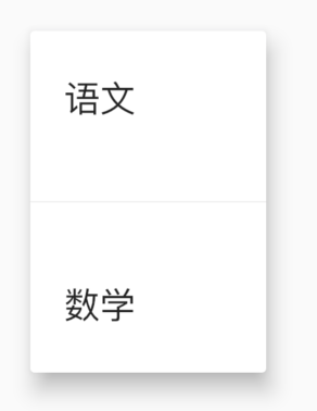
# PopupMenuButton
PopupMenuButton<String>(
  itemBuilder: (context) {
    return <PopupMenuEntry<String>>[
      PopupMenuItem<String>(
        value: '语文',
        child: Text('语文'),
      ),
      PopupMenuItem<String>(
        value: '数学',
        child: Text('数学'),
      ),
      PopupMenuItem<String>(
        value: '英语',
        child: Text('英语'),
      ),
      PopupMenuItem<String>(
        value: '生物',
        child: Text('生物'),
      ),
      PopupMenuItem<String>(
        value: '化学',
        child: Text('化学'),
      ),
    ];
  },
)
2
3
4
5
6
7
8
9
10
11
12
13
14
15
16
17
18
19
20
21
22
23
24
25
26
- tooltip 是长按时弹出的提示
- elevation: 5,阴影值
- padding: EdgeInsets.all(5),内边距
- color: Colors.red,弹出菜单的背景颜色
menu 有一个非常重要的参数 Offset,这个参数是控制菜单弹出的位置,通常情况下,菜单在当前按钮下面展示
# PopupMenuDivider
PopupMenuDivider 默认高度为 16,注意这个高度并不是分割线的高度,而是分割线控件的高度,设置为 50 代码:
# CheckedPopupMenuItem
# PopupMenuButton 计算位置
PopupMenuButton 是如何计算的,有助于帮助我们理解:
final PopupMenuThemeData popupMenuTheme = PopupMenuTheme.of(context);
    final RenderBox button = context.findRenderObject();
    final RenderBox overlay = Overlay.of(context).context.findRenderObject();
    final RelativeRect position = RelativeRect.fromRect(
      Rect.fromPoints(
        button.localToGlobal(widget.offset, ancestor: overlay),
        button.localToGlobal(button.size.bottomRight(Offset.zero), ancestor: overlay),
      ),
      Offset.zero & overlay.size,
    );
    final List<PopupMenuEntry<T>> items = widget.itemBuilder(context);
2
3
4
5
6
7
8
9
10
11
# 弹出、告警提示登
# AlertDialog
RaisedButton(
  child: Text('切换'),
  onPressed: () {
    showDialog(
        context: context,
        builder: (context) {
          return AlertDialog(
            title: Text('提示'),
            content: Text('确认删除吗?'),
            actions: <Widget>[
              FlatButton(child: Text('取消'),onPressed: (){},),
              FlatButton(child: Text('确认'),onPressed: (){},),
            ],
          );
        });
  },
)
2
3
4
5
6
7
8
9
10
11
12
13
14
15
16
17
AlertDialog 的属性相对比较丰富,可以设置 title 样式、content 样式、背景颜色、阴影值,设置是形状
AlertDialog(
  title: Text('提示'),
  content: Text('确认删除吗?'),
  backgroundColor: Colors.lightBlueAccent,
  elevation: 24,
  shape: RoundedRectangleBorder(borderRadius: BorderRadius.circular(50)),
  actions: <Widget>[
    FlatButton(child: Text('取消'),onPressed: (){},),
    FlatButton(child: Text('确认'),onPressed: (){},),
  ],
)
2
3
4
5
6
7
8
9
10
11
# CupertinoAlertDialog
RaisedButton(
  child: Text('切换'),
  onPressed: () {
    showCupertinoDialog(
        context: context,
        builder: (context) {
          return CupertinoAlertDialog(
            title: Text('提示'),
            content: Text('确认删除吗?'),
            actions: <Widget>[
              CupertinoDialogAction(child: Text('取消'),onPressed: (){},),
              CupertinoDialogAction(child: Text('确认'),onPressed: (){},),
            ],
          );
        });
  },
)
2
3
4
5
6
7
8
9
10
11
12
13
14
15
16
17
# SimpleDialog
# Dialog
# 改变形状组件
改变形状组件
Flutter 中很多组件都有一个叫做 shape 的属性,类型是 ShapeBorder,比如 Button 类、Card 等组件,shape 表示控件的形状,系统已经为我们提供了很多形状,对于没有此属性的组件,可以使用 Clip 类组件进行裁减
# BeveledRectangleBorder 斜角矩形边框
RaisedButton(
  shape: BeveledRectangleBorder(
      side: BorderSide(width: 1, color: Colors.red),
      borderRadius: BorderRadius.circular(10)),
  child: Text('老孟'),
  onPressed: () {},
)
2
3
4
5
6
7
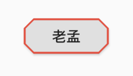
- 如果设置的半径比控件还大,就会变成菱形
- 同理,如果半径设置为 0,就是矩形。
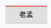
# Border
Border 允许单独设置每一个边上的线条样式.
RaisedButton(
  shape: Border(
    top: BorderSide(color: Colors.red,width: 2)
  ),
  child: Text('老孟'),
  onPressed: () {},
)
2
3
4
5
6
7
# BorderDirectional
# CircleBorder
# ContinuousRectangleBorder
连续的圆角矩形,直线和圆角平滑连续的过渡,和 RoundedRectangleBorder 相比,圆角效果会小一些。
# RoundedRectangleBorder
# StadiumBorder
类似足球场的形状,两边圆形,中间矩形
# OutlineInputBorder
# UnderlineInputBorder
# ClipRect
ClipRect 组件使用矩形裁剪子组件,通常情况下,ClipRect 作用于 CustomPaint 、 CustomSingleChildLayout 、 CustomMultiChildLayout 、 Align 、 Center 、 OverflowBox 、 SizedOverflowBox 组件,例如 ClipRect 作用于 Align,可以仅显示上半部分
ClipRect(
  child: Align(
    alignment: Alignment.topCenter,
    heightFactor: 0.5,
    child: Container(
      height: 150,
      width: 150,
      child: Image.asset(
        'images/1.png',
        fit: BoxFit.cover,
      ),
    ),
  ),
)
2
3
4
5
6
7
8
9
10
11
12
13
14
clipper 参数定义裁剪规则,下面具体介绍。
- clipBehavior 参数定义了裁剪的方式,只有子控件超出父控件的范围才有裁剪的说法,各个方式说明如下:
- none:不裁剪,系统默认值,如果子组件不超出边界,此值没有任何性能消耗。
- hardEdge:裁剪但不应用抗锯齿,速度比 none 慢一点,但比其他方式快。
- antiAlias:裁剪而且抗锯齿,此方式看起来更平滑,比 antiAliasWithSaveLayer 快,比 hardEdge 慢,通常用于处理圆形和弧形裁剪。
- antiAliasWithSaveLayer:裁剪、抗锯齿而且有一个缓冲区,此方式很慢,用到的情况比较少
# ClipRRect
ClipRRect 组件可以对子组件进行圆角裁剪,默认圆角半径为 0,注意 ClipRRect 有 2 个 R
# ClipOval
ClipOval 裁剪为椭圆形,椭圆形的大小为正切父组件,因此如果父组件为正方形,切出来是圆形
# ClipPath
ClipPath.shape(
  shape: StadiumBorder(),
  child: Container(
    height: 150,
    width: 250,
    child: Image.asset(
      'images/1.png',
      fit: BoxFit.cover,
    ),
  ),
)
2
3
4
5
6
7
8
9
10
11
shape 参数是 ShapeBorder 类型,系统已经定义了很多形状,介绍如下:
- RoundedRectangleBorder:圆角矩形
- ContinuousRectangleBorder:直线和圆角平滑连续的过渡,和 RoundedRectangleBorder 相比,圆角效果会小一些。
- StadiumBorder:类似于足球场的形状,两端半圆。
- BeveledRectangleBorder:斜角矩形。效果如图:
- CircleBorder:圆形
# CustomClipper
CustomClipper并不是一个组件,而是一个abstract(抽象)类,使用CustomClipper可以绘制出任何我们想要的形状,比如三角形
Widget build(BuildContext context) {
return Center(
child: ClipPath(
clipper: TrianglePath(),
child: Container(
height: 150,
width: 250,
child: Image.asset(
'images/1.png',
fit: BoxFit.cover,
),
),
),
);
}
2
3
4
5
6
7
8
9
10
11
12
13
14
15
16
class TrianglePath extends CustomClipper<Path>{
Path getClip(Size size) {
var path = Path();
path.moveTo(size.width/2, 0);
path.lineTo(0, size.height);
path.lineTo(size.width, size.height);
return path;
}
bool shouldReclip(CustomClipper<Path> oldClipper) {
return true;
}
}
2
3
4
5
6
7
8
9
10
11
12
13
14
15
我们还可以绘制五角星
class StarPath extends CustomClipper<Path> {
StarPath({this.scale = 2.5});
final double scale;
double perDegree = 36;
/// 角度转弧度公式
double degree2Radian(double degree) {
return (pi * degree / 180);
}
Path getClip(Size size) {
var R = min(size.width / 2, size.height / 2);
var r = R / scale;
var x = size.width / 2;
var y = size.height / 2;
var path = Path();
path.moveTo(x, y - R);
path.lineTo(x - sin(degree2Radian(perDegree)) * r,
y - cos(degree2Radian(perDegree)) * r);
path.lineTo(x - sin(degree2Radian(perDegree * 2)) * R,
y - cos(degree2Radian(perDegree * 2)) * R);
path.lineTo(x - sin(degree2Radian(perDegree * 3)) * r,
y - cos(degree2Radian(perDegree * 3)) * r);
path.lineTo(x - sin(degree2Radian(perDegree * 4)) * R,
y - cos(degree2Radian(perDegree * 4)) * R);
path.lineTo(x - sin(degree2Radian(perDegree * 5)) * r,
y - cos(degree2Radian(perDegree * 5)) * r);
path.lineTo(x - sin(degree2Radian(perDegree * 6)) * R,
y - cos(degree2Radian(perDegree * 6)) * R);
path.lineTo(x - sin(degree2Radian(perDegree * 7)) * r,
y - cos(degree2Radian(perDegree * 7)) * r);
path.lineTo(x - sin(degree2Radian(perDegree * 8)) * R,
y - cos(degree2Radian(perDegree * 8)) * R);
path.lineTo(x - sin(degree2Radian(perDegree * 9)) * r,
y - cos(degree2Radian(perDegree * 9)) * r);
path.lineTo(x - sin(degree2Radian(perDegree * 10)) * R,
y - cos(degree2Radian(perDegree * 10)) * R);
return path;
}
bool shouldReclip(StarPath oldClipper) {
return oldClipper.scale != this.scale;
}
}
2
3
4
5
6
7
8
9
10
11
12
13
14
15
16
17
18
19
20
21
22
23
24
25
26
27
28
29
30
31
32
33
34
35
36
37
38
39
40
41
42
43
44
45
46
47
48
49