# App 级别组件
# MaterialApp
MaterialApp(
  home: Scaffold(
    appBar: AppBar(
      title: Text('老孟'),
    ),
  ),
)
2
3
4
5
6
7
- home 参数是 App 默认显示的页面
- title 参数是应用程序的描述,在 Android 上,在任务管理器的应用程序快照上面显示,
- 在 IOS 上忽略此属性,IOS 上任务管理器应用程序快照上面显示的是 Info.plist 文件中的 CFBundleDisplayName。
- 如果想根据区域显示不同的描述使用 onGenerateTitle
MaterialApp(
  title: '老孟',
  onGenerateTitle: (context) {
    var local = Localizations.localeOf(context);
    if (local.languageCode == 'zh') {
      return '老孟';
    }
    return 'laomeng';
  },
  ...
)
2
3
4
5
6
7
8
9
10
11
routes、initialRoute、onGenerateRoute、onUnknownRoute 是和路由相关的 4 个属性,路由简单的理解就是页面,路由的管理通常是指页面的管理,比如跳转、返回等。
# MaterialApp 按照如下的规则匹配路由
- 路由为/,home 不为 null 则使用 home。
- 使用 routes 指定的路由。
- 使用 onGenerateRoute 生成的路由,处理除 home 和 routes 以外的路由。
- 如果上面都不匹配则调用 onUnknownRoute
MaterialApp(
  routes: {
    'container': (context) => ContainerDemo(),
    'fitted': (context) => FittedBoxDemo(),
    'icon': (context) => IconDemo(),
  },
  initialRoute: '/',
  home: Scaffold(
    appBar: AppBar(
      title: Text('老孟'),
    ),
  ),
  onGenerateRoute: (RouteSettings routeSettings){
        print('onGenerateRoute:$routeSettings');
        if(routeSettings.name == 'icon'){
          return MaterialPageRoute(builder: (context){
            return IconDemo();
          });
        }
      },
      onUnknownRoute: (RouteSettings routeSettings){
        print('onUnknownRoute:$routeSettings');
        return MaterialPageRoute(builder: (context){
          return IconDemo();
        });
      },
  ...
)
2
3
4
5
6
7
8
9
10
11
12
13
14
15
16
17
18
19
20
21
22
23
24
25
26
27
28
initialRoute 设置为/,那么加载 home 页面。
如果 initialRoute 设置为 icon,在 routes 中存在,所以加载 routes 中指定的路由,即 IconDemo 页面。
如果 initialRoute 设置为 icons1,此时 routes 中并不存在名称为 icons1 的路由,调用 onGenerateRoute,如果 onGenerateRoute 返回路由页面,则加载此页面,如果返回的是 null,且 home 不为 null,则加载 home 参数指定的页面,如果 home 为 null,则回调 onUnknownRoute。
# 主题
- theme、darkTheme、themeMode 是关于主题的参数,设置整个 App 的主题,包括颜色、字体、形状等,修改主题颜色为红色用法如下:
MaterialApp(
  theme: ThemeData(
    primaryColor: Colors.red
  ),
  darkTheme: ThemeData(
      primaryColor: Colors.red
  ),
  themeMode: ThemeMode.dark,
2
3
4
5
6
7
8
# 国际化
locale、localizationsDelegates、localeListResolutionCallback、localeResolutionCallback、supportedLocales是区域设置和国际化相关的参数,如果 App 支持多国语言,那么就需要设置这些参数,默认情况下,Flutter 仅支持美国英语,如果想要添加其他语言支持则需要指定其他 MaterialApp 属性,并引入 flutter_localizations 包,到 2019 年 4 月,flutter_localizations 包已经支持 52 种语言,如果你想让你的应用在 iOS 上顺利运行,那么你还必须添加“flutter_cupertino_localizations”包。
# 在pubspec.yaml文件中添加包依赖:

dependencies:
  flutter:
    sdk: flutter
  flutter_localizations:
    sdk: flutter
  flutter_cupertino_localizations: ^1.0.1
2
3
4
5
6
7
8
MaterialApp(
  localizationsDelegates: [
    GlobalMaterialLocalizations.delegate,
    GlobalWidgetsLocalizations.delegate,
    GlobalCupertinoLocalizations.delegate
  ],
  supportedLocales: [
    const Locale('zh', 'CH'),
    const Locale('en', 'US'),
  ],
  ...
)
2
3
4
5
6
7
8
9
10
11
12
- GlobalMaterialLocalizations.delegate :为 Material Components 库提供了本地化的字符串和其他值。
- GlobalWidgetsLocalizations.delegate:定义 widget 默认的文本方向,从左到右或从右到左。
- GlobalCupertinoLocalizations.delegate:为 Cupertino(ios 风格)库提供了本地化的字符串和其他值。
supportedLocales 参数指定了当前 App 支持的语言。
localeResolutionCallback 和 localeListResolutionCallback 都是对语言变化的监听,比如切换系统语言等,localeResolutionCallback 和 localeListResolutionCallback 的区别是:
- localeResolutionCallback 返回的第一个参数是当前语言的 Locale,
- localeListResolutionCallback 返回当前手机支持的语言集合,在早期的版本手机没有支持语言的集合,只显示当前语言
因此我们只需使用 localeListResolutionCallback 即可,通过用户手机支持的语言和当前 App 支持的语言返回一个语言选项。
通常情况下,如果用户的语言正好是 App 支持的语言,那么直接返回此语言,如果不支持,则返回一个默认的语言,用法如下:
MaterialApp(
  localeListResolutionCallback:
      (List<Locale> locales, Iterable<Locale> supportedLocales) {
    if (locales.contains('zh')) {
      return Locale('zh');
    }
    return Locale('en');
  },
  ...
)
2
3
4
5
6
7
8
9
10
在 App 中也可以通过如下方法获取区域设置:
Locale myLocale = Localizations.localeOf(context);
还有几个方便调试的选项,debugShowMaterialGrid:打开网格调试
MaterialApp(
  debugShowMaterialGrid: true,
2
showPerformanceOverlay:打开性能检测
MaterialApp(
  showPerformanceOverlay: true,
2
右上角有一个 DEBUG 的标识,这是系统在 debug 模式下默认显示的,不显示的设置如下:
MaterialApp(
  debugShowCheckedModeBanner: true,
  ...
)
2
3
4
5
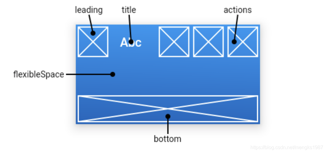
# Scaffold
TIP
Scaffold 实现了 Material 风格的基本布局结构,它提供了展示 drawers、snack bars 和 bottom sheets 的功能。
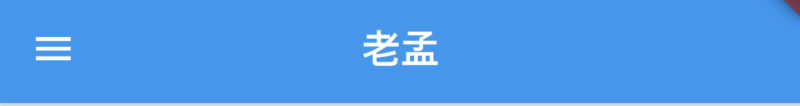
Scaffold(
  appBar: AppBar(
    title: Text('老孟'),
  ),
  body: Center(
    child: Text('一枚有态度的程序员'),
  ),
)
2
3
4
5
6
7
8
- 顶部蓝色区域就是 appBar,通常设置 AppBar。
- drawer 和 endDrawer 分别表示从左边和右边出现的抽屉式控件,用法如下:
- bottomNavigationBar 表示底部导航,用法如下:
Scaffold(
  bottomNavigationBar: BottomNavigationBar(
    items: <BottomNavigationBarItem>[
      BottomNavigationBarItem(title: Text('首页'),icon: Icon(Icons.home)),
      BottomNavigationBarItem(title: Text('书籍'),icon: Icon(Icons.book)),
      BottomNavigationBarItem(title: Text('我的'),icon: Icon(Icons.perm_identity)),
    ],
  ),
  ...
)
2
3
4
5
6
7
8
9
10
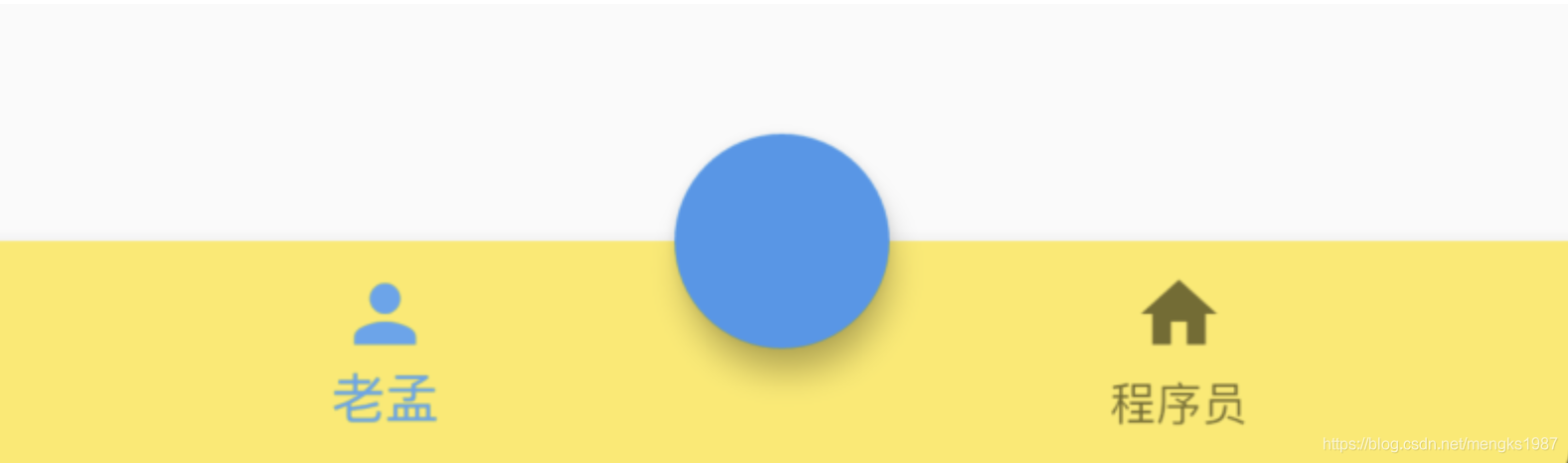
- floatingActionButton 默认位于右下角,
Scaffold(
  floatingActionButton: FloatingActionButton(),
)
2
3
改变其位置,设置按钮嵌入底部导航栏:
Scaffold(
  floatingActionButtonLocation: FloatingActionButtonLocation.centerDocked,
  floatingActionButton: FloatingActionButton(),
  bottomNavigationBar: BottomNavigationBar(
    backgroundColor: Colors.yellow,
    items: [
      BottomNavigationBarItem(icon: Icon(Icons.person),title: Text('老孟')),
      BottomNavigationBarItem(icon: Icon(Icons.home),title: Text('程序员'))
    ],
  )
)
2
3
4
5
6
7
8
9
10
11
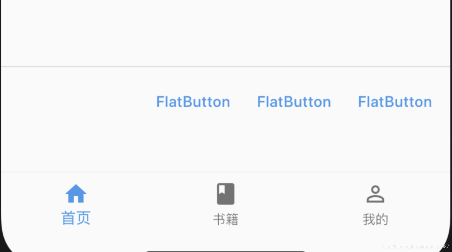
- persistentFooterButtons 位于 body 之下,bottomNavigationBar 之上,不会随着 body 滚动而滚动,用法如下:
Scaffold(
  persistentFooterButtons: <Widget>[
    FlatButton(onPressed: (){},child: Text('FlatButton'),),
    FlatButton(onPressed: (){},child: Text('FlatButton'),),
    FlatButton(onPressed: (){},child: Text('FlatButton'),),
  ],
2
3
4
5
6
- bottomSheet 位于 persistentFooterButtons 之上,用法如下:
Scaffold(
  bottomSheet: BottomSheet(
      onClosing: () {},
      backgroundColor: Colors.lightBlue,
      builder: (context) {
        return Container(
          height: 150,
          alignment: Alignment.center,
          child: Text('BottomSheet'),
        );
      }),
      ...
 )
2
3
4
5
6
7
8
9
10
11
12
13
# AppBar
AppBar 是 material 风格的应用程序栏
- leading 属性通常设置返回按钮,用法如下:
Scaffold(
  appBar: AppBar(
    leading: BackButton(),
    title: Text('老孟'),
  ),
)
2
3
4
5
6
如果 leading 属性未设置,且 Scaffold 设置了 Drawer 则显示打开 Drawer 的图标
Scaffold(
  appBar: AppBar(
    title: Text('老孟'),
  ),
  drawer: Drawer(),
)
2
3
4
5
6
- 通过 automaticallyImplyLeading 属性改变其行为,设置为 false 将不会自动设置控件,用法如下:
AppBar(
  automaticallyImplyLeading: false,
  ...
)
2
3
4
- title 属性是应用栏上的标题,一般设置 Text 文本,用法如下:
AppBar(
  title: Text('老孟'),
)
2
3
注意 title 不一定是居中的,在 Android 平台默认是靠左的,设置居中代码如下:
AppBar(
  title: Text('老孟'),
  centerTitle: true,
)
2
3
4
- actions 在程序栏的右边,可以设置多个功能按钮,用法如下:
Scaffold(
  appBar: AppBar(
    title: Text('老孟'),
    actions: <Widget>[
      IconButton(icon: Icon(Icons.menu),onPressed: (){},),
      IconButton(icon: Icon(Icons.add),onPressed: (){},)
    ],
  )
2
3
4
5
6
7
8
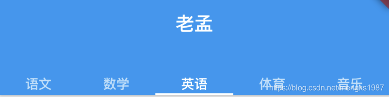
- bottom 属性通常请求下设置 TabBar
Scaffold(
  appBar: AppBar(
    title: Text('老孟'),
    bottom:TabBar(
      tabs: <Widget>[
        Text('语文'),
        Text('数学'),
        Text('英语'),
        Text('体育'),
        Text('音乐'),
      ],
      controller: TabController(length: 5,vsync: this),
    )
  )
)
2
3
4
5
6
7
8
9
10
11
12
13
14
15
- 置阴影、形状、背景颜色:
AppBar(
          elevation: 10,
          shape:
              RoundedRectangleBorder(borderRadius: BorderRadius.circular(20)),
          backgroundColor: Colors.red,
  )
2
3
4
5
6
- 设置 icon 样式及文字样式:
AppBar(
    iconTheme:IconThemeData(size: 24),
    actionsIconTheme: IconThemeData(size: 24),
    textTheme: TextTheme(title: TextStyle(color: Colors.red)),
    title: Text('老孟'),
  )
2
3
4
5
6
# Drawer
Drawer 一般和 Scaffold 组合使用
通过代码的方式打开 Drawer,需要获取 Scaffold 状态,用法如下:
RaisedButton(
          child: Text(
            '点我,弹出Drawer',
          ),
          onPressed: () {
            Scaffold.of(context).openDrawer();
          },
        )
2
3
4
5
6
7
8
取消 Drawer 也很容易,向左滑动即可,当然也可以通过代码的方式控制:
RaisedButton(
          child: Text(
            '点我,隐藏Drawer',
          ),
          onPressed: () {
            Navigator.of(context).pop();
          },
        )
2
3
4
5
6
7
8
Drawer 里面可以放置任何组件,但是一般使用 ListView,分为 DrawerHeader 和 ListTiles,用法如下:
drawer: Drawer(
          child: ListView(
            children: <Widget>[
              DrawerHeader(),
              ListTile(),
              ListTile(),
              ListTile(),
              ListTile(),
            ],
          ),
        ),
2
3
4
5
6
7
8
9
10
11
# BottomNavigationBar
BottomNavigationBar 和 BottomNavigationBarItem 配合 Scaffold 控件使用可以实现底部导航效果,类似于微信底部的导航效果
Scaffold(
      bottomNavigationBar: BottomNavigationBar(
        items: <BottomNavigationBarItem>[
          BottomNavigationBarItem(title: Text('首页'),icon: Icon(Icons.home)),
          BottomNavigationBarItem(title: Text('书籍'),icon: Icon(Icons.book)),
          BottomNavigationBarItem(title: Text('我的'),icon: Icon(Icons.perm_identity)),
        ],
      ),
    );
2
3
4
5
6
7
8
9
点击其他 2 个 item 时没有反应,添加切换效果:
int _currentIndex = 0;
BottomNavigationBar(
    onTap: (int index) {
        setState(() {
            _currentIndex = index;
        });
    },
    currentIndex: _currentIndex,
    ...
2
3
4
5
6
7
8
9
currentIndex 代表当前显示导航的索引,当前切换时调用 onTap,在 onTap 回调中调用 setState 方法改变_currentIndex 的值达到切换的效果。
ottomNavigationBar 有 2 种显示模式,其中一种是 fixed 效果,前面的展示就是 fixed 效果,这也是默认值,另一种是 shifting
# BottomNavigationBarItem
如果导航的图标是自己设计的图标,这时仅仅通过 BottomNavigationBar 是无法实现我们想要的效果的,比如微信的导航的效果,虽然选中和未选中也是颜色的区别,但图标不是 Icons 自带的图标,想要实现切换 2 个图标需要 BottomNavigationBarItem 控件的支持,其中的 icon 和 activeIcon 分别代表未选中和选中。
# SnackBar
带有可选操作的轻量级消息,在屏幕底部短暂显示,SnackBar 一般不单独使用,而是配合Scaffold.of(context).showSnackBar进行弹出展示。
设置背景和形状:
Scaffold.of(context).showSnackBar(SnackBar(
  backgroundColor: Colors.red,
  elevation: 8,
  shape: RoundedRectangleBorder(borderRadius: BorderRadius.circular(100)),
  content: Text('老孟,专注分享Flutter相关技术'),
));
2
3
4
5
6
onVisible 属性是在显示的时候调用。
SnackBar 的有 2 种弹出形式,默认是 fixed,直接在底部弹出,另一种是 floating,悬浮在底部
Scaffold.of(context).showSnackBar(SnackBar(
            content: Row(
              children: <Widget>[
                Icon(Icons.check,color: Colors.green,),
                Text('下载成功')],
            ),
            behavior: SnackBarBehavior.floating,
          ));
2
3
4
5
6
7
8
# SnackBarAction
Scaffold.of(context).showSnackBar(SnackBar(
  action: SnackBarAction(
    label: '确定',
    onPressed: () {
      print('确定');
    },
  ),
  content: Text('老孟,专注分享Flutter相关技术'),
));
2
3
4
5
6
7
8
9
默认情况下每个显示 4 秒,如果有 10 个,那么 40 秒内会一直弹消息,体验明显不友好,我们希望的效果是如果有新的消息时,旧的都消息立刻消失,显示新的消息,只需在弹出新的 SnackBar 时移除现在的 SnackBar,
Scaffold.of(context).removeCurrentSnackBar();
Scaffold.of(context).showSnackBar(...);
2